
Range of View Studios
Role:
Brand & Visual Identity Designer
Industry:
Creative Studio
Scope:
Identity, Color, Type, Components
Location:
Atlanta, Georgia
How a rough, passionate music collective became an Atlanta creative studio, and the identity system I helped build to carry it there: brand identity, visual identity, color palettes, fonts, buttons, gradients, and more.
It started with two kids at a bakery table
We were working on a project at Sweet Hut Bakery when two kids walked up and showed us their little agency. It was pretty rough, but they had a vision and real passion. We took everything apart, helped define their mission, and organized their identity.
My Contributions
Range of View began as a music community where friends taught each other what they knew. Along the way, its founder, Ayush Basu, realized he loved branding. My work gave that realization a system.
01
Defined the brand and visual identity, from the mission through to the og moodboards.
02
Built the color palettes, gradients, and type system that every page and post draws from.
03
Designed the buttons and UI components that carry the identity across the website.
Where They Started

A lot of energy, very little structure
The original site was built for a music community: a player up top, a gallery, a magazine, and service blocks that didn't quite say what the studio did or who it was for. Every piece had personality, but none of it spoke with one voice.
Taking It Apart
Start with the mission
We pulled every piece onto the table: services, audiences, the music roots, the magazine. Then we rebuilt the structure around one clear promise, page by page.
The mission, in their words
From web and video to sound and AI, we shape ideas into experiences that connect.
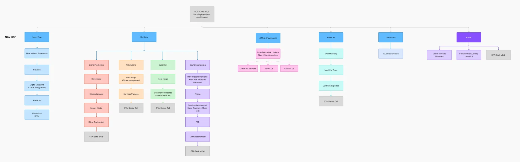
The rebuilt sitemap: services, the CTRL·A playground, the OG ROV story, and a clear path to booking a call.
Finding the Look
Dark rooms, warm light, a little bit mixtape
The references kept pulling the same direction: deep, near-black surfaces lit by something warm, and geometric type with a playful streak. The halftone cut-outs gave it the hand-made music-zine energy the studio grew up on.
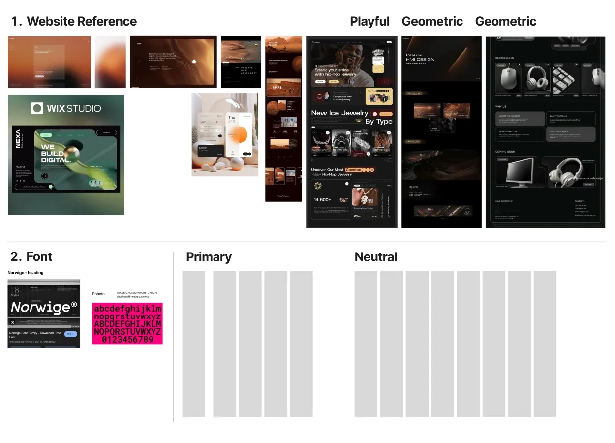
Moodboard: website references, Norwige for headings, Roboto for body.
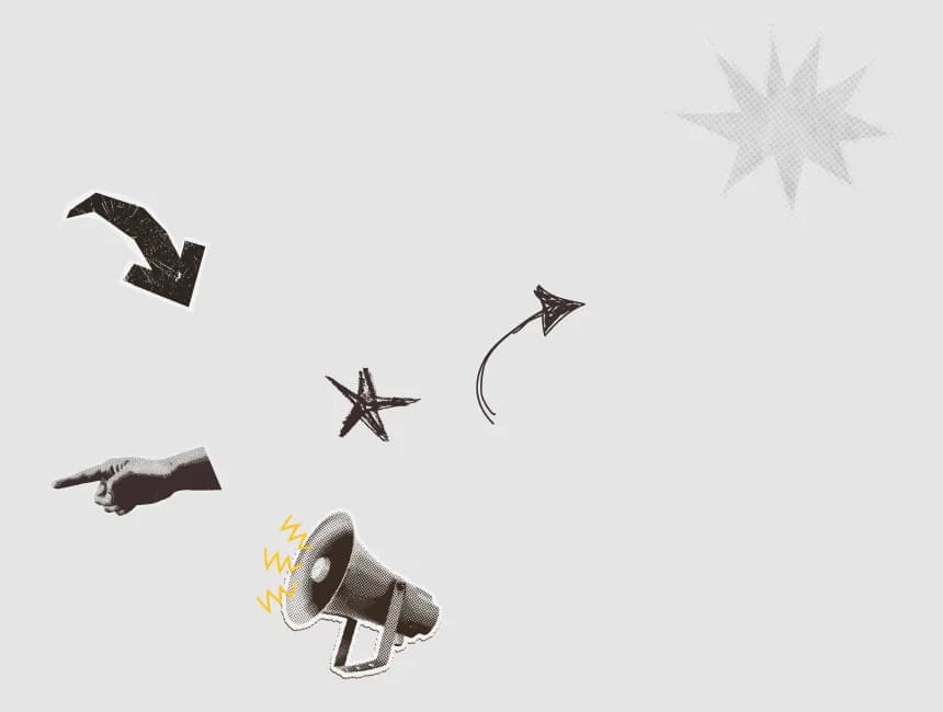
Design elements: halftone arrows, a pointing hand, a megaphone.
The Identity System
An identity built to hold everything they make: the website, the socials, and every client project that came after.
Color palette
#0B0908
Base surface
#43211D
Depth, shadows
#55291E
Cards, panels
#A24C2B
Brand core
#B76E3C
Highlights
#E7985F
Accents, labels
#FDF1E3
Type on dark
Gradients
Ember
Banners, CTAs, social headers
Glow
Stories, hero light, focal moments
Dusk
Section washes behind dark UI

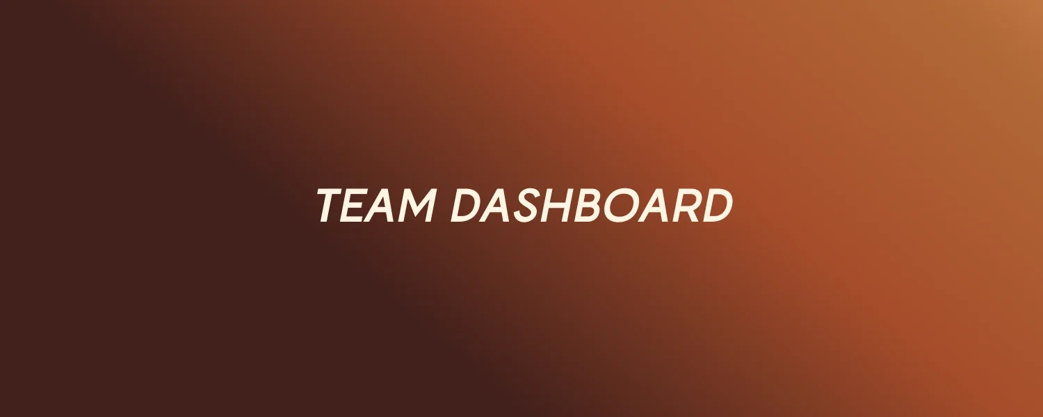
Typography
Creative Identity
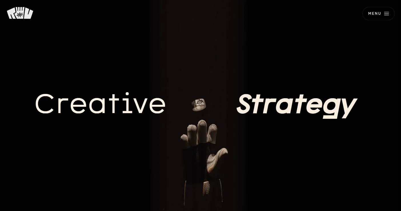
The signature move: a light, open word paired with a heavy italic. One steady, one in motion. It runs through the hero, the services, and every social header.
Headings
Norwige
Body
Roboto
Labels
Wide-tracked caps
Buttons and components
The real components, rebuilt from the live site. Hover them.
Blue or brown?
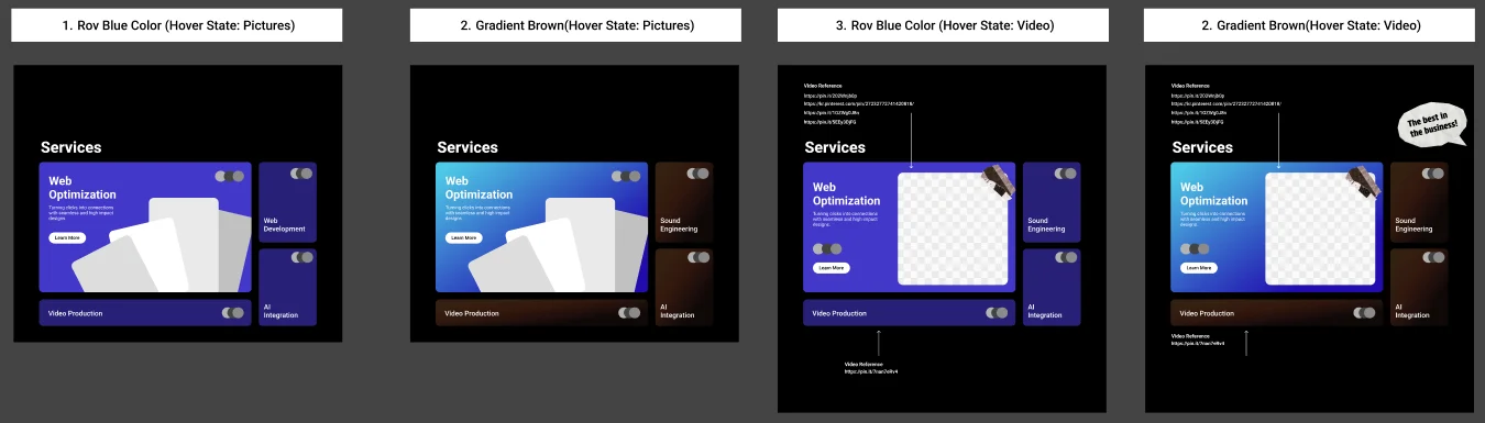
We tested ROV Blue against a brown gradient on the service cards, each with photo and video hover states. Blue looked like every other tech agency. Brown felt warm, a little cinematic, and unmistakably theirs.
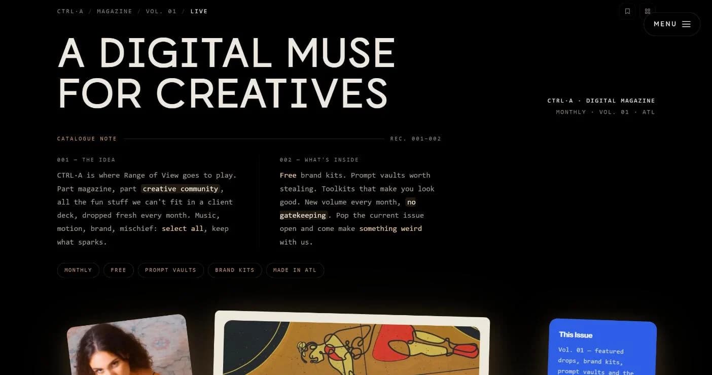
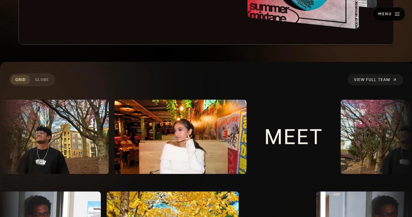
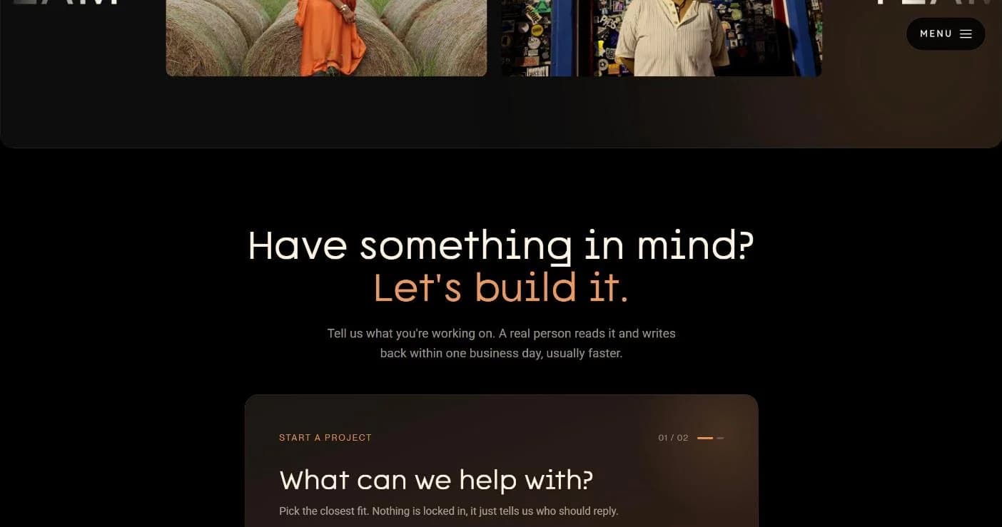
The System, Live
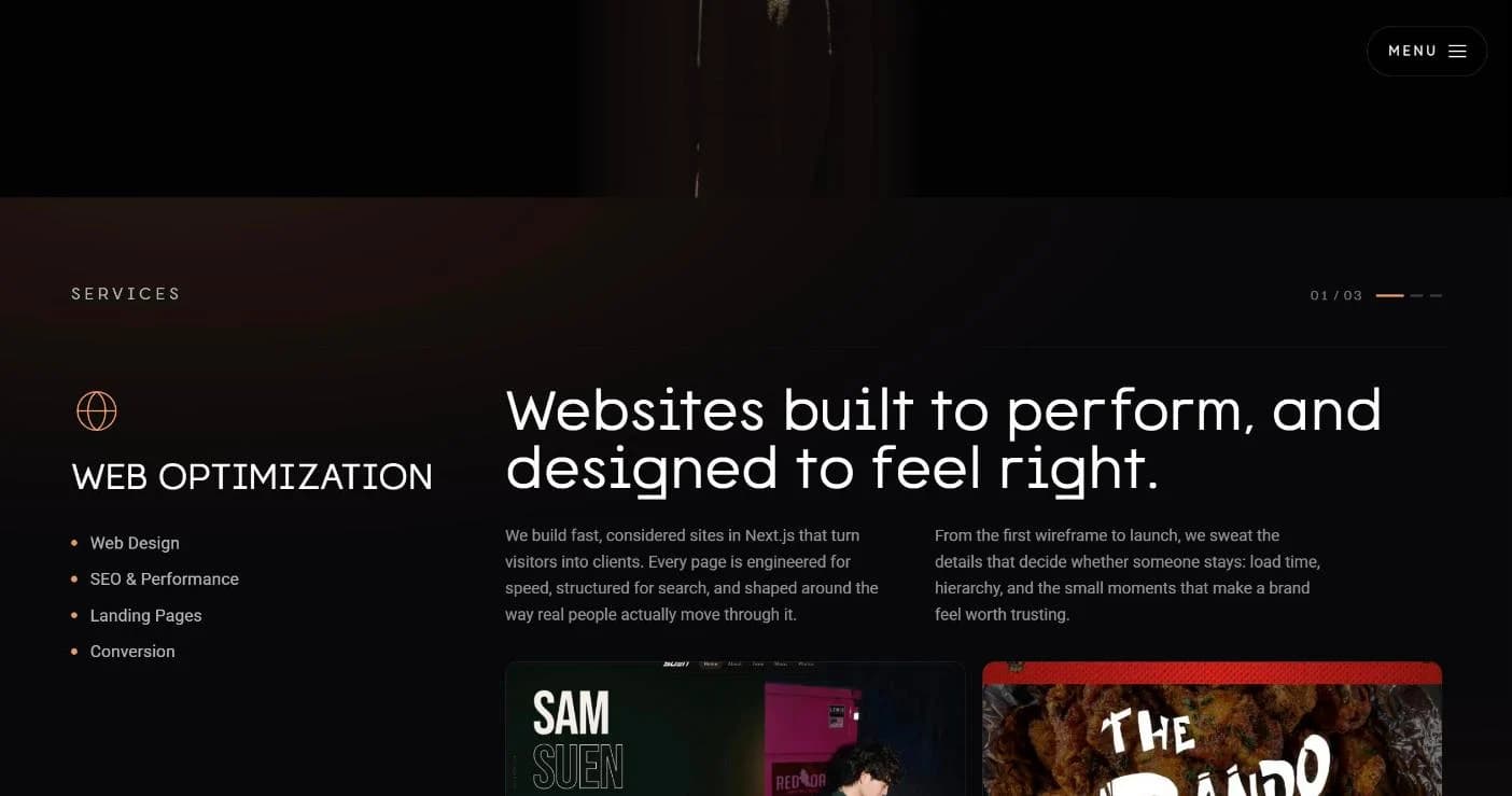
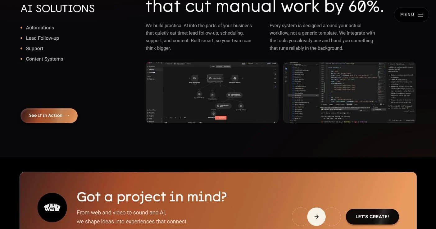
Everything above, working together on rovstudios.com.
What It Became
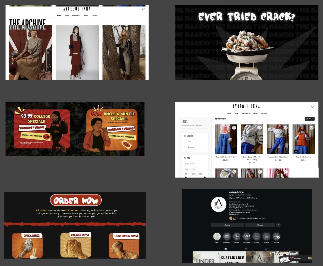
It turned into a world we couldn't have imagined from that table. With an identity that finally matched their ambition, Range of View went on to do brand identity for Wisdom ATL and The Bando, fashion shows at Ponce, and more.
- Wisdom ATLBrand identity
- The Bando ATLBrand identity
- Ponce City MarketFashion shows
- Music video Made together, for fun
What I Learned
01
Structure is creative work.
The mission and the sitemap did more for this brand than any color choice. Taking it apart came first.
02
A palette is a promise.
Seven colors and three gradients meant every new page, post, and deck already knew how to look like ROV.
03
Say yes at the table.
A great project can start as an interruption. Passion that rough is worth slowing down for.
The space is the limit.
Still making more as we go.